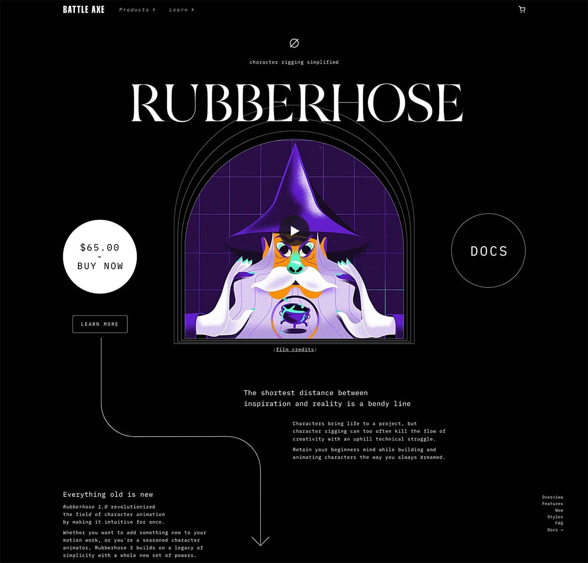
In 2015 we launched our online shop on Squarespace, and it served us well. But many years have passed and the grain of the internet has changed a lot since then.
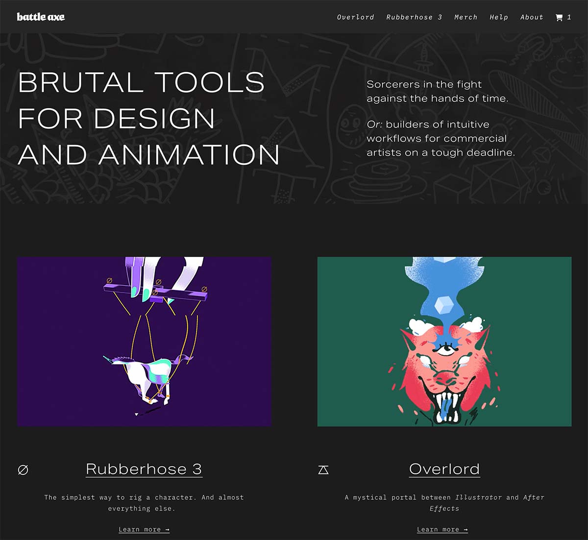
In early 2023 we tried building a custom site from scratch but that made us sad 😢. On top of regular coding duties, the overhead of setting up and maintaining something like that was too much for our tiny team. The idea of a new site got filed away under yeah, maybe one day.
As the year came to a close, we kept getting more excited about Rive. Experimenting with the platform took us down a rabbit hole of tools that work well with Rive, and that led us to Framer.
Job descriptions
Introducing a new app or tool to a workflow is like hiring a new employee. If you don't clarify the job description it can be easy to ask too much or not know when it is successful.
Our baseline for a site builder was that needed to be:
- Easy to update
- Integrate with paddle.com for purchasing
Next we listed off all the things we wanted that would justify the time to build something new:
Animation and design
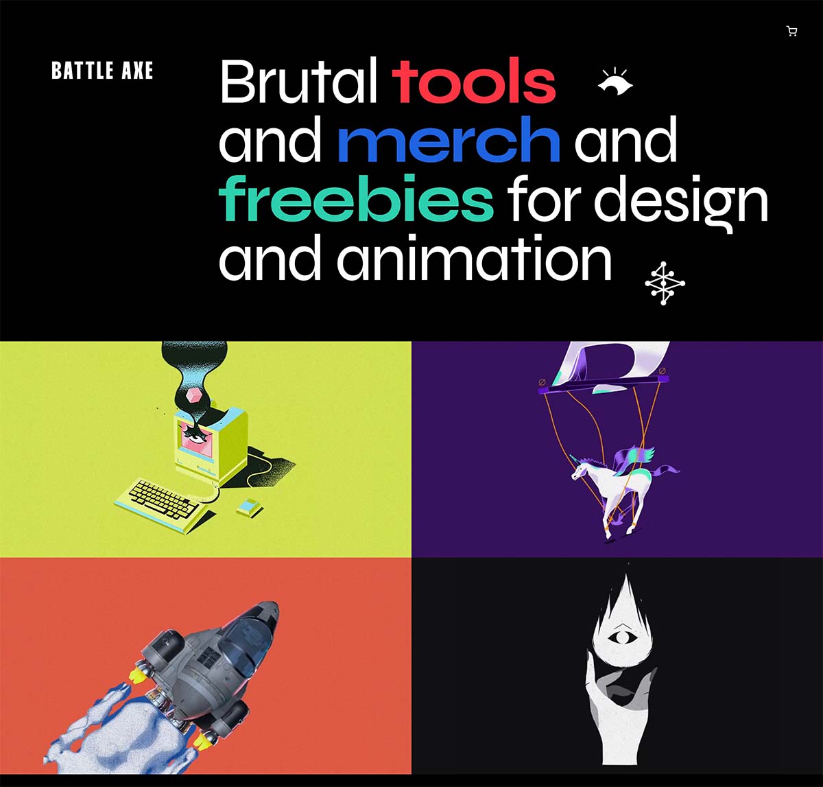
We are a design and animation tool development company, and the platform we picked almost a decade ago limited us to images and MP4s. I believe that the mediums have their own inherent texture and the web is no different. We wanted the freedom to work with this medium to communicate our products more effectively.
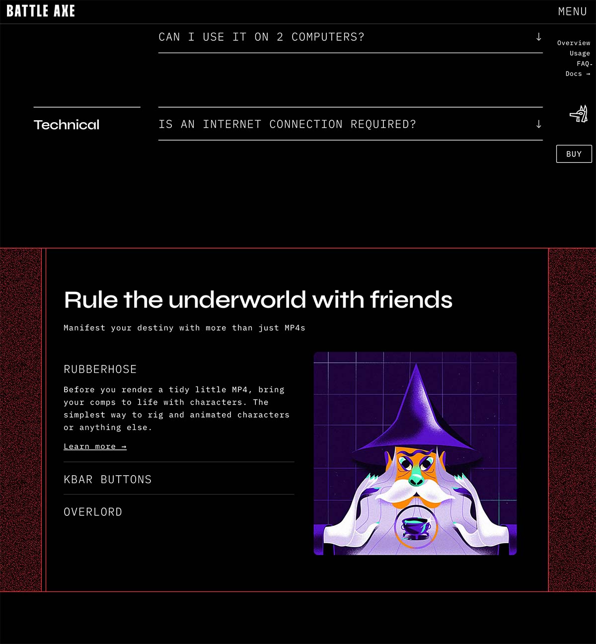
Our plan was to use Rive for illustrations, but we also wanted to utilize UI animation more effectively. We wanted to be able to customize how things worked for mobile and show what was most important instead of just creating long scrolls.
Layout freedom
What happens if you want a grid of videos followed by full-bleed imagery and sticky scroll buttons that float outside of the content column? What if you want a 13 column grid where all elements blocks based on fibonacci numbers?
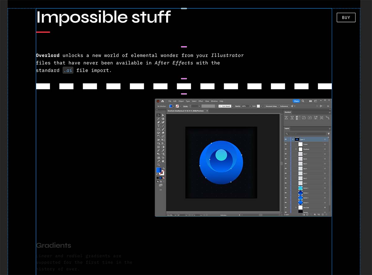
Template-based sites try to keep things simple, but kind of lock you into a format. While things should be as simple as possible, this was too simple for us.
We wanted our home in cyberspace to have spots for the diverse materials that surround what we do. Also, lets bring back the word Cyberspace please because it sounds cool.
Docs consolidation
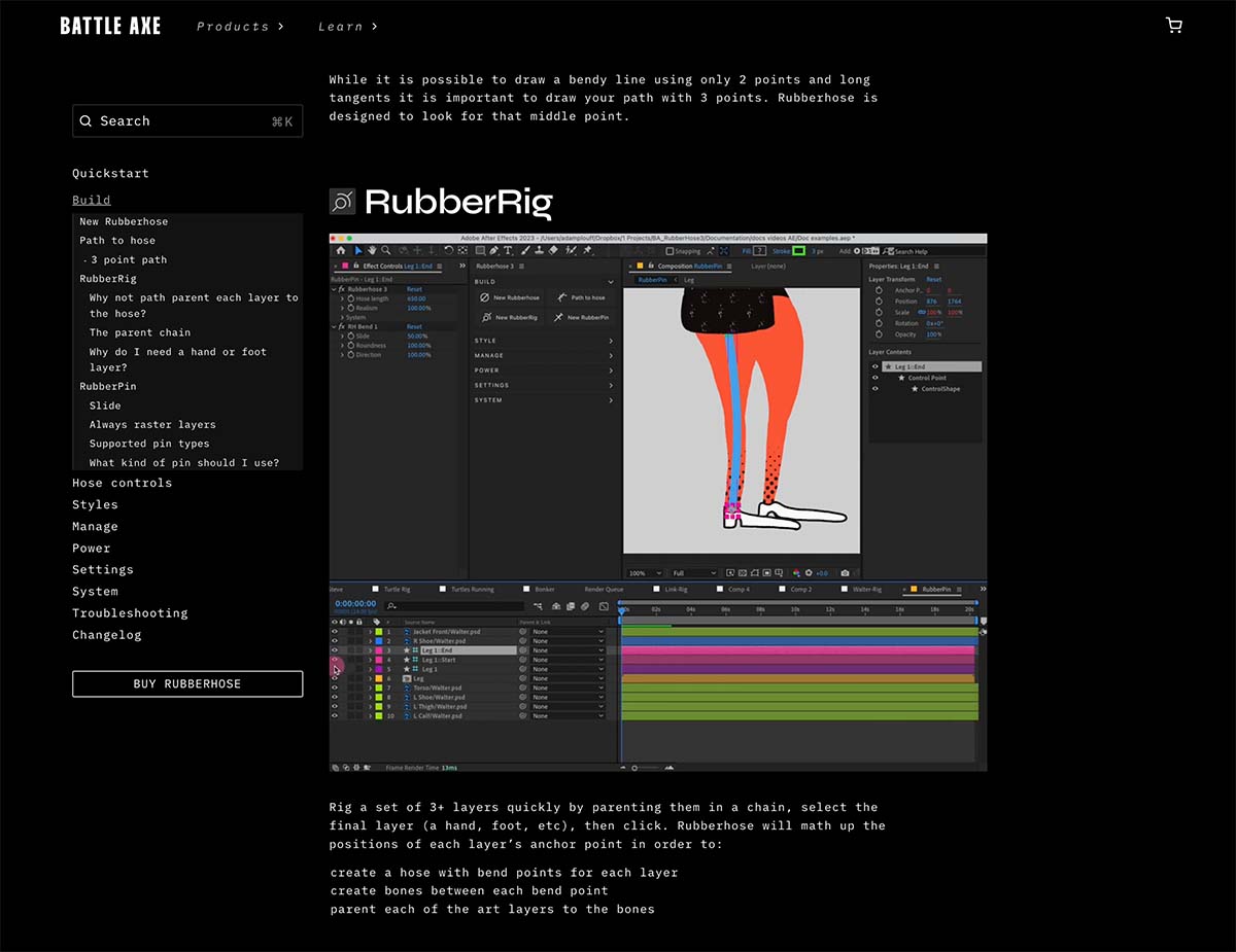
As our product count grew, we ended up with a completely separate documentation site. This isn't uncommon since most web platforms for products have different setups than are typically required for education. We wanted to unify these opposites and make learning a tool much simpler.
Framer 😎
If you're unfamiliar, Framer is one of the newer no-code options (like Wix or Webflow) for building a custom website (not just templates) but without the complexity. We are all about simplicity and flexibility around here.
The platform is gaining popularity among designers for a good reason. It works a lot like Figma, and they have a plugin for moving design assets between the two apps (layer data transfer 🩵). With Framer, you are free to create reusable components and variants, and easily animate between with control over interpolation, with a lot of power to design interaction in the same interface without code.
If your eyes just glazed over at components and variants, think Ae precomps and Essential Graphics for editing a small part of a reusable precomp, but for your website.
There was a small learning curve for some of the concepts and my process involved lots of YouTube and purchasing a few premade components.
YouTube recommendations


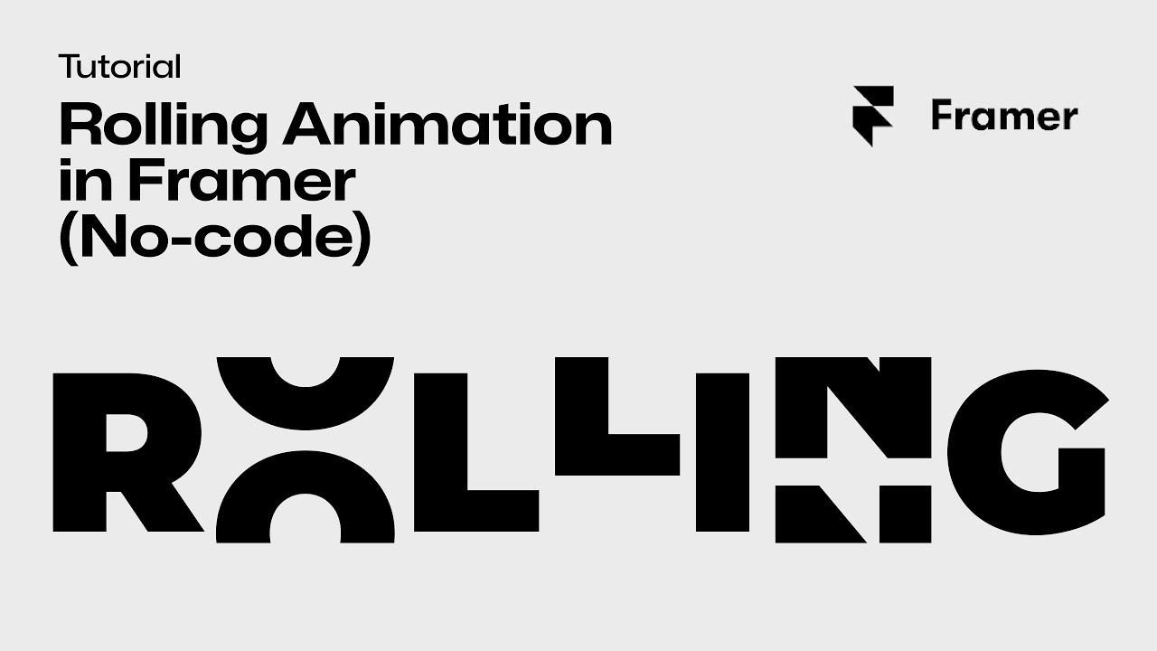

Component recommendations
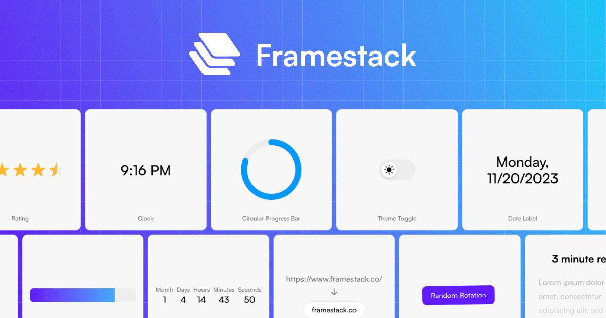
These are very well designed and helped us make sense of some of the basic React concepts I don't understand (we are a Svelte family)
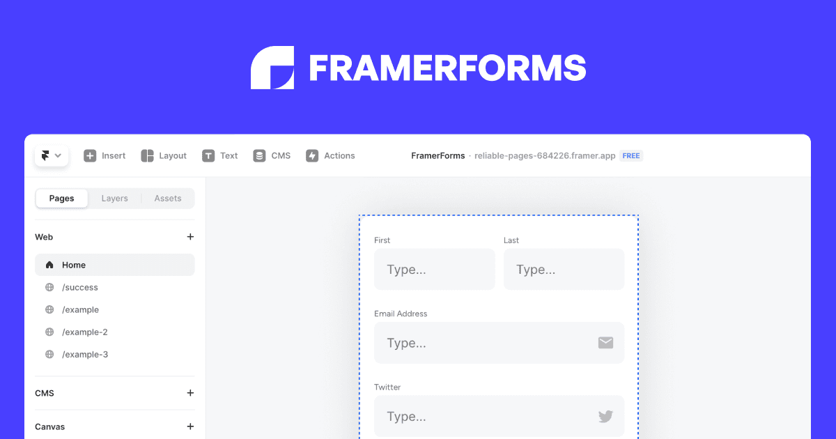
Framer has a built-in field component, but this one allowed us to connect our contact page to make.com for formatting a message to send on to Zendesk where we handle tickets.
Stuff we're proud of
On the homepage there might be a secret land. Have you found it yet?
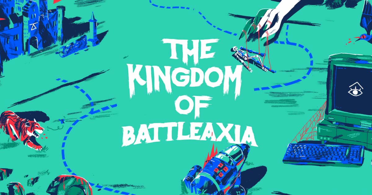
More than a year ago, Reece drew an amazing illustration based on some nonsense I wrote after an 8 hour flight. We went back and forth several times on how to implement it, but nothing ever felt right with the limitations of our old site.
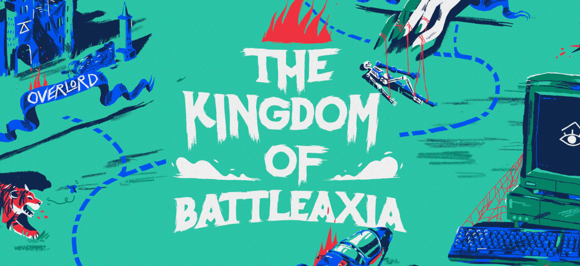
We were able to build the layered setup with animation and responsive scaling in about a day with Framer.
Note: it's the lowest-tech part of the whole site with layered transparent gifs.
Choose your own adventure
The daily journey of a motion designer can feel like a series of endless quests and second-guessing, so why not simulate the danger?
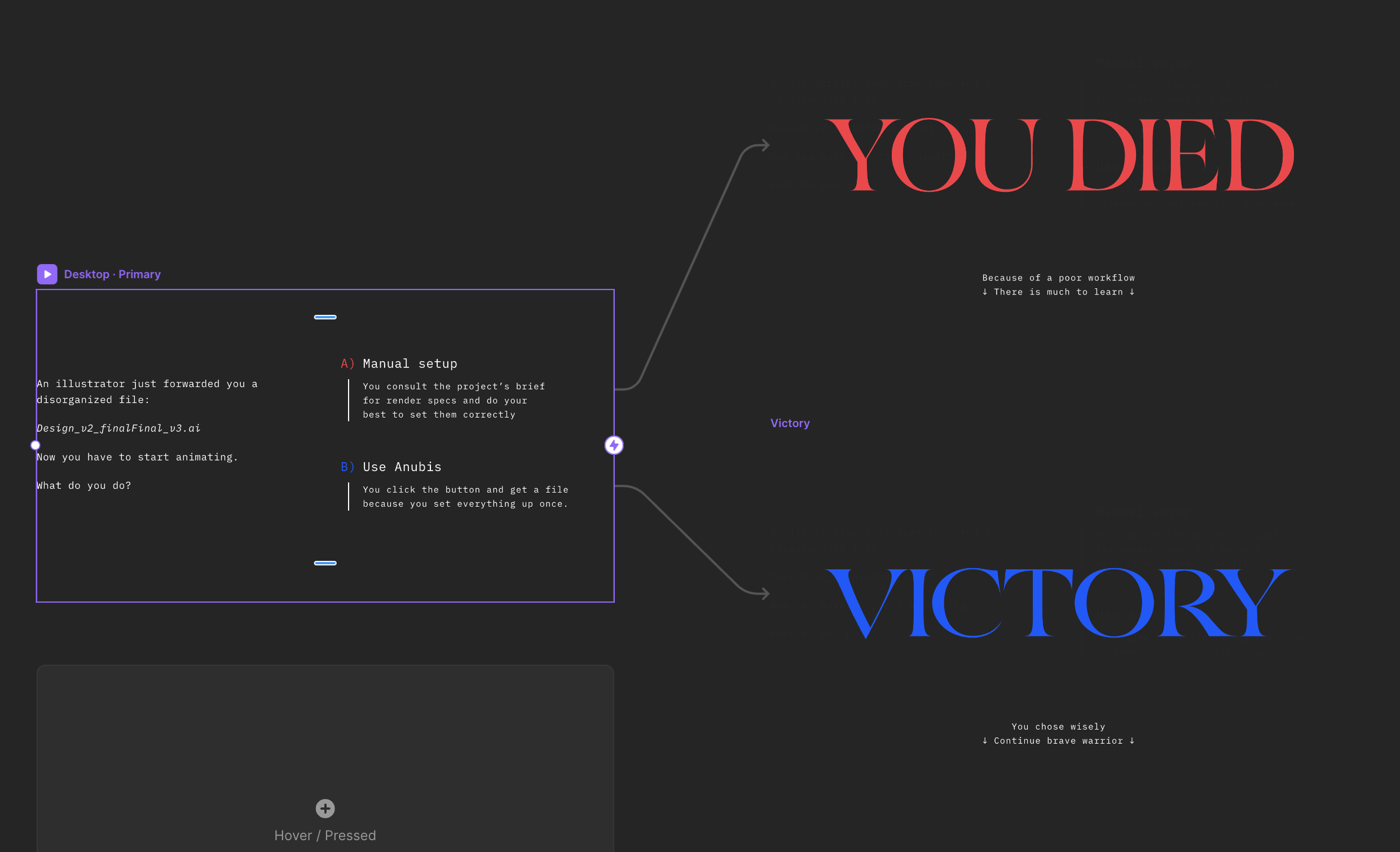
Framer's interaction tree let us move between component variants almost like a state machine, then set timers on switching back to the idle state.
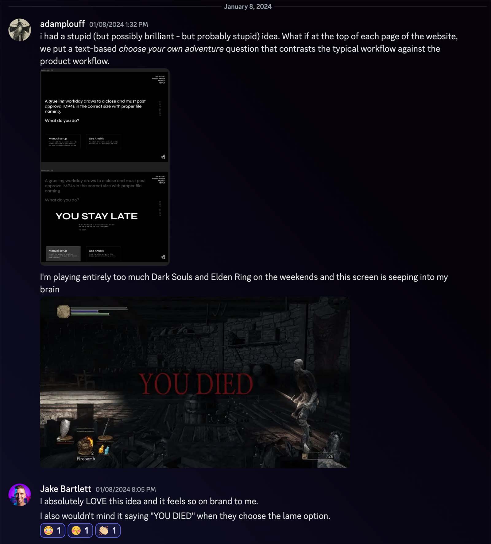
Also, hey, i had a stupid idea is how most of our favorite ideas usually start out.
Rive headers
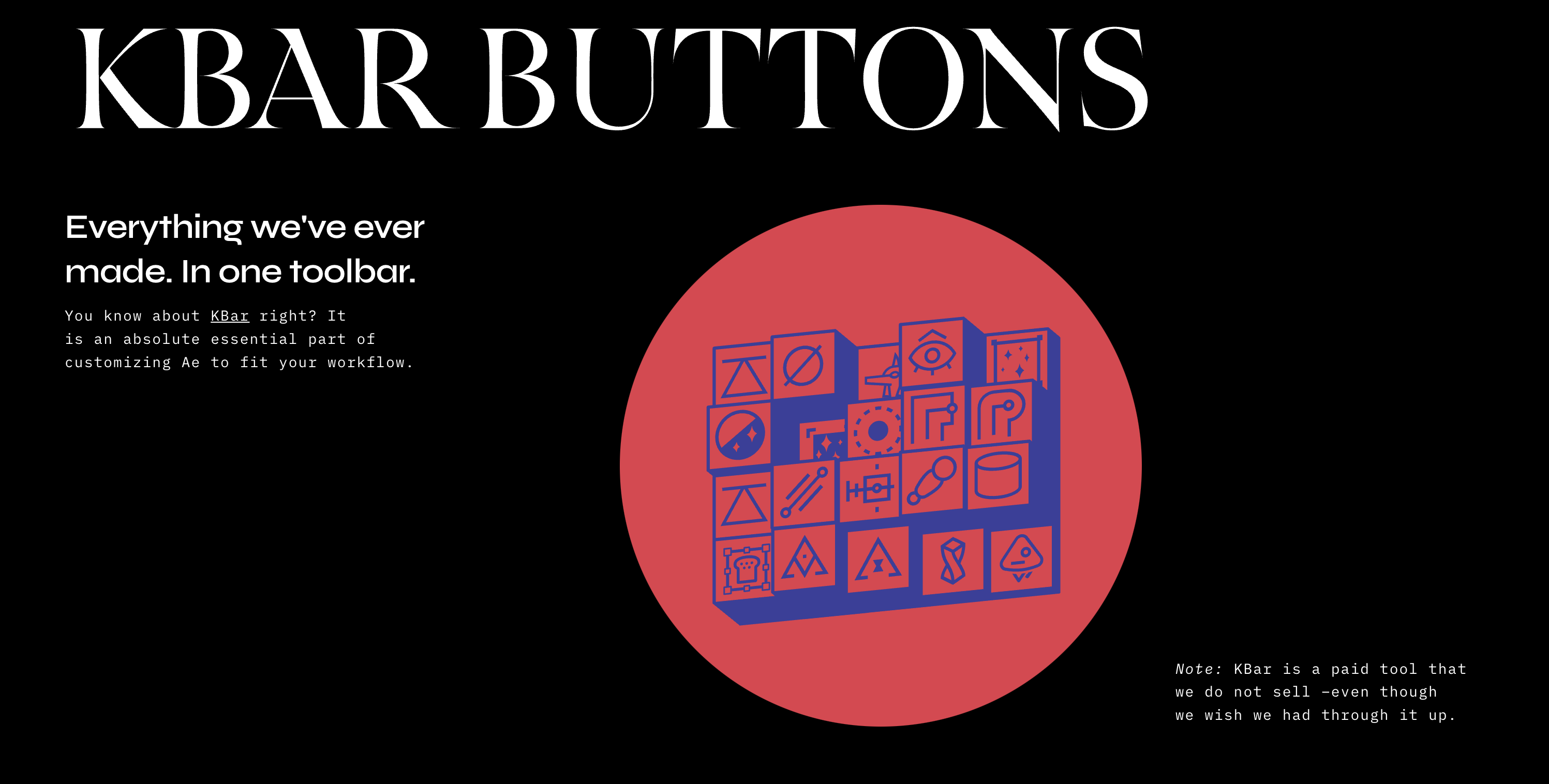
We love our product films, and we love our freebies, but there's not enough budget to do films for everything. I created an alternate layout for the freebies and Jake came up with a steady stream of animations that help set the tone for each page.
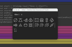
We are not yet Rive experts, and we had planned to start integrating Rive into the pages gradually. Then once we started looking at the loops we decided to give it a try. Over a week of play, we started with a loop for Beatgrid, then an eyeball that tracks the mouse, then a noisy and reactive set of KBar buttons.
Takeaways
We aren't done yet, but for the first time, it feels like we have a home that can grow with our ideas.
Possibilities for interaction
- I have been a motion designer working with linear video
- I have been a coder building products that people work with
With this new era of the web, it feels like these two spheres of my life are venn-diagramming into something really interesting. It feels good to be curious about what's possible instead of feeling like everything has been discovered already.
Rive
Aside from interactivity, we went from a highly compressed 137kb MP4, down to a 3kb Rive file that looked better. That's pretty much magic. We are going to keep experimenting with web animation and we'll do our best to share what we figure out. It's an exciting place to be.
Websites
Nothing against social media, but it feels good to own a website that is ours and can be what we want it to be. It doesn't have to be built on Framer, but get yourself little spot that you own, away from the algorithms.
Simplicity
Find the tools that make it easy to build things that capture your curiosity. We are living in a wild technological world and it can feel like a fulltime job keeping up with it all. But you don't have to. Explore and find a few things that work for you and know that it's ok to use a powerful tool for something simple.
Obligatory photo of Twig the wolf
